
In an era where data drives decision-making, the ability to visualize and analyze information effectively is paramount. ArcGIS Online Dashboards, a product by Esri, provides a dynamic platform for organizations and individuals to gain actionable insights through interactive visualizations. As a GIS expert, leveraging this tool can revolutionize how spatial data is understood and applied. In this article by GeoInfoSpot, we delve into the capabilities, applications, and best practices for using ArcGIS Online Dashboards to unlock the full potential of geographic data.
What Are ArcGIS Online Dashboards?
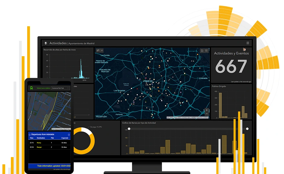
ArcGIS Online Dashboards are web-based applications that enable users to monitor, analyze, and communicate spatial and non-spatial data through intuitive visual interfaces. These dashboards combine maps, charts, gauges, and other widgets into a single, interactive display. By seamlessly integrating real-time data, they allow users to track key performance indicators, trends, and patterns with ease.
Key Features and Functionalities
- Customizable Widgets: Dashboards come equipped with a variety of widgets, including maps, bar charts, pie charts, lists, indicators, and more. These elements can be tailored to meet the specific needs of a project or audience.
- Real-Time Data Integration: Dashboards support real-time data feeds, enabling users to display and analyze live updates. This is particularly useful for applications such as traffic monitoring, emergency response, and environmental tracking.
- Interactive Elements: Users can interact with dashboard components through filtering, selection, and dynamic updates, making it easier to explore and analyze data.
- Data Sources: Dashboards can pull data from various sources, including ArcGIS Online web maps, feature layers, and external APIs.
- Sharing and Collaboration: Dashboards are easy to share with stakeholders, whether they are internal team members or the general public. With configurable access settings, users can control who views and interacts with their data.
Applications of ArcGIS Online Dashboards
1. Urban Planning and Development
Urban planners use dashboards to visualize demographic data, land use, and infrastructure projects. By overlaying multiple data layers, they can identify growth opportunities and assess potential impacts.
2. Disaster Management
Emergency response teams rely on real-time dashboards to monitor incidents, allocate resources, and coordinate efforts. For instance, during a flood, dashboards can display live rainfall data, flood extents, and evacuation routes.
3. Public Health
Health agencies use dashboards to track disease outbreaks, vaccination rates, and healthcare accessibility. This was particularly evident during the COVID-19 pandemic, where dashboards played a critical role in disseminating information.
4. Environmental Monitoring
Dashboards facilitate the monitoring of environmental variables such as air quality, deforestation, and wildlife habitats. They enable stakeholders to respond promptly to ecological changes.
5. Business Intelligence
Organizations utilize dashboards for market analysis, logistics, and asset management. By integrating spatial data with business metrics, they can make informed decisions that drive growth and efficiency.
Best Practices for Creating Effective Dashboards
- Define Clear Objectives: Identify the purpose of the dashboard and the questions it aims to answer. This ensures that the design aligns with user needs.
- Prioritize User Experience: Use intuitive layouts and visuals that are easy to interpret. Avoid clutter by focusing on the most relevant information.
- Leverage Interactivity: Incorporate filters, selectors, and drill-down capabilities to allow users to explore data in depth.
- Optimize Performance: Minimize the number of data layers and widgets to enhance loading speed and responsiveness.
- Ensure Data Accuracy: Regularly update and validate data sources to maintain the credibility and reliability of the dashboard.
Future Trends in Dashboard Technology
The capabilities of ArcGIS Online Dashboards continue to evolve with advancements in technology. Artificial intelligence and machine learning are expected to play a larger role in automating data analysis and providing predictive insights. Additionally, the integration of immersive technologies such as augmented reality (AR) will enhance the way users interact with spatial data.
Conclusion
ArcGIS Online Dashboards empower GIS professionals to transform complex datasets into actionable insights. By combining spatial and non-spatial information in a visually compelling format, they facilitate better decision-making across various industries. Whether you are tracking real-time events, analyzing trends, or communicating findings, ArcGIS Online Dashboards offer a versatile and powerful solution to unlock the true potential of your data.